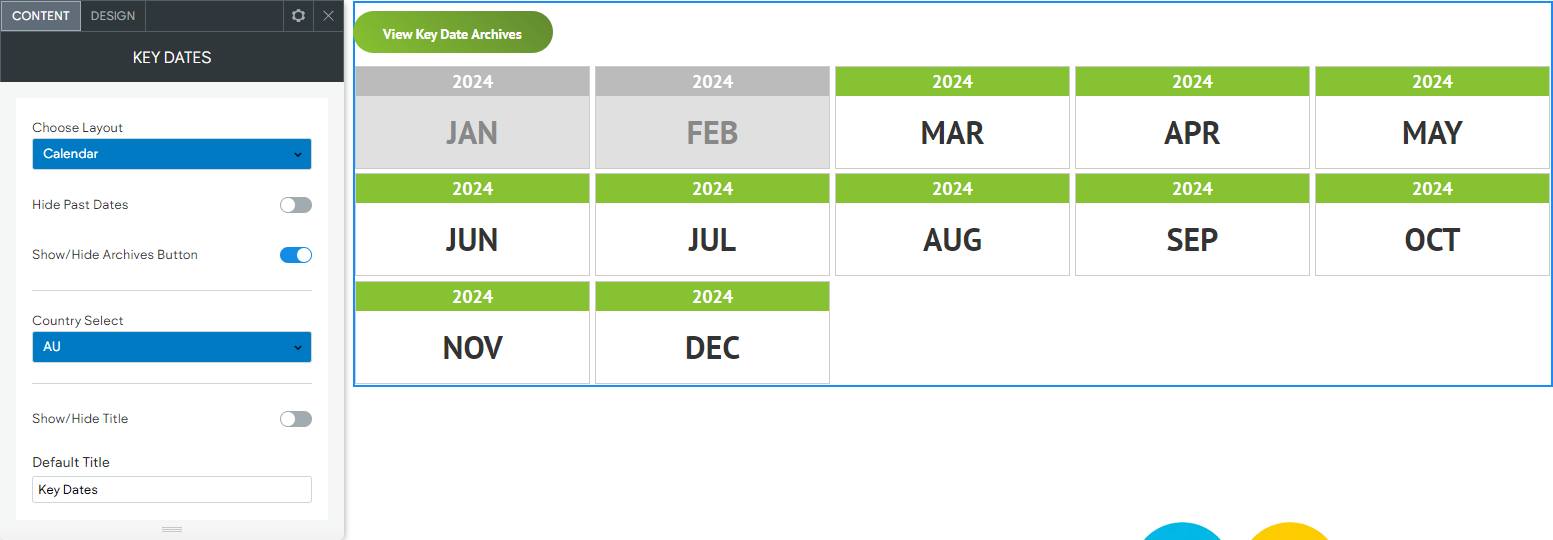
CCH Web Manager
Neither your customers nor Google has a second to spare waiting for a page to load.
Page speed and user experience should be key considerations for an effective online presence. Google’s algorithm includes measurements relating to the user experience of your websites visitors, including how fast your page loads and responds to user interaction.
How CCH Web Manager helps you
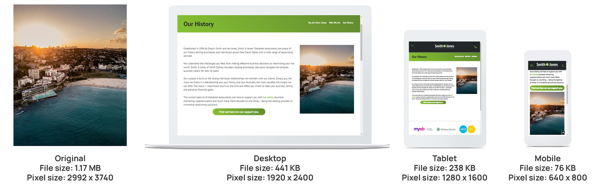
CCH Web Manager incorporates inbuilt optimisations of content, such as images, to better enhance the loading speeds. Every image that’s uploaded to your website goes through an optimisation process where up to 5 reduced-size copies of the image are created. For example, if a 2000px width image is uploaded, 5 new optimised copies will be created. If a 100px width image is uploaded, no new images will be created because the size of an original uploaded image isn't increased by the automatic optimisation.
When you the add the image to a page on your site, CCH Web Manager automatically inserts the appropriate version of that image into the desktop, tablet, and mobile views of your website, making sure your site visitors always see the correct sized image for their device.
Below you can see the same image uploaded to a CCH Web Manager website, but inserted in different pages at different sizes, notice how the editor has automatically adjusted the image dimensions and file size based on how it is being served up to the end user.
What else can you do to optimise loading speed?
Biggest is not always the best - While uploading the biggest resolution for your site guarantees that your site's images are high resolution for your clients and customers, keep in mind that unnecessarily large images can also have a detrimental effect on your page speed. Since high-resolution images are scaled down, users do not normally notice the difference in resolution. It is better to upload images that are as large as how they are intended to be used. For example, if you have a picture that is going to be displayed at 300px by 300px on your site, you do not want to upload it as a 4000px by 4000px image. The below table is a guide of the maximum width for uploading images, depending on their use and whether they will appear on all versions of your site, or just desktop, just mobile, etc.
| Image Type | Image Width |
|---|---|
| Background or Hero image | 2880px |
| Desktop full width image* | 1920px |
| Staff profile | 300-400px |
| Tablet only | 1280px |
| Mobile only | 640px |
*Desktop full width images will be automatically optimised for display on tablet and mobile devices.
Professional photography - If you are having a professional photographer take staff profile photos, ask them to provide the full size image as well as a resized version suitable for your website. Around 200-300px wide would suit most websites, depending on the layout you choose for your Team or Staff page.
Host videos in dedicated video platforms - Other things that can help improve speed include hosting videos on YouTube or Vimeo and embedding them using the Video widget, or the advanced ‘Video Gallery’ widget for pages with lots of videos.